
The Smooth Switch With Slicc.
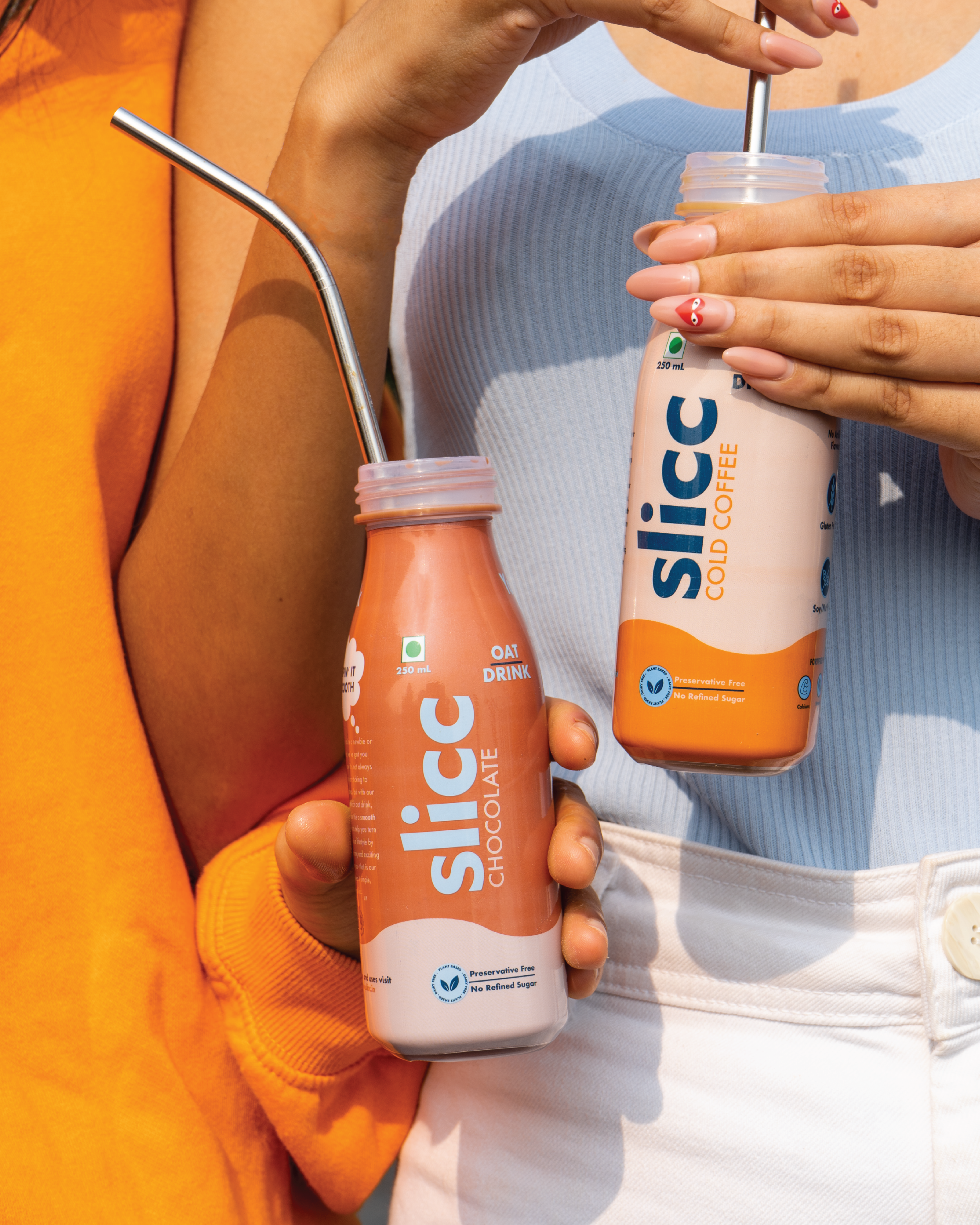
Slicc breaks the misconception that oat milk is a downgrade from conventional milk. The brand's goal is to give people an experience of a smooth switch while enjoying the benefits of oat milk. Slicc aims to be your healthy breakfast, snack time and work treat, helping you turn your choices into a lifestyle.Slicc's packaging design has been handpicked by DesignRush, the well-known platform that promotes exceptional package designs, to be featured in "The Best Packaging Designs" compilation.
Branding Board.
Slicc was founded when Namrata began making oat milk from her home kitchen, and soon realised the need for this product in the Indian market. She came to us with a vision of creating an honest tone of voice that showcases the brand identity with a "less is more" mantra. They wanted the brand to have a modern, visually aesthetic, yet mature look and feel to cater to a diverse audience.The brand vision is to be the biggest player for Oat milk in India, and we wanted to help them achieve this. To do so, we carefully incorporated the founder's vision for the brand along with conducting primary and secondary market research to better understand the trends of the oat milk market. While selecting brand colours, we conducted extensively primary as well as secondary research, browsing through shelves in retail stores & supermarkets to gain qualitative information on other milk brands and creating a differentiation strategy for Slicc.Slicc's target audience was to focus on Millennials and the Gen-Z of India, specifically a group that is willing to try new things and branch out into the non-dairy world. It was important that the brand's communication was young but at the same time, it appealed to an older audience as well. We were also aware of the fact that consumers on average take 2 seconds to make a choice while browsing at a supermarket/ store, so we wanted to create eye-catching packaging and get the brand identity across simply and efficiently.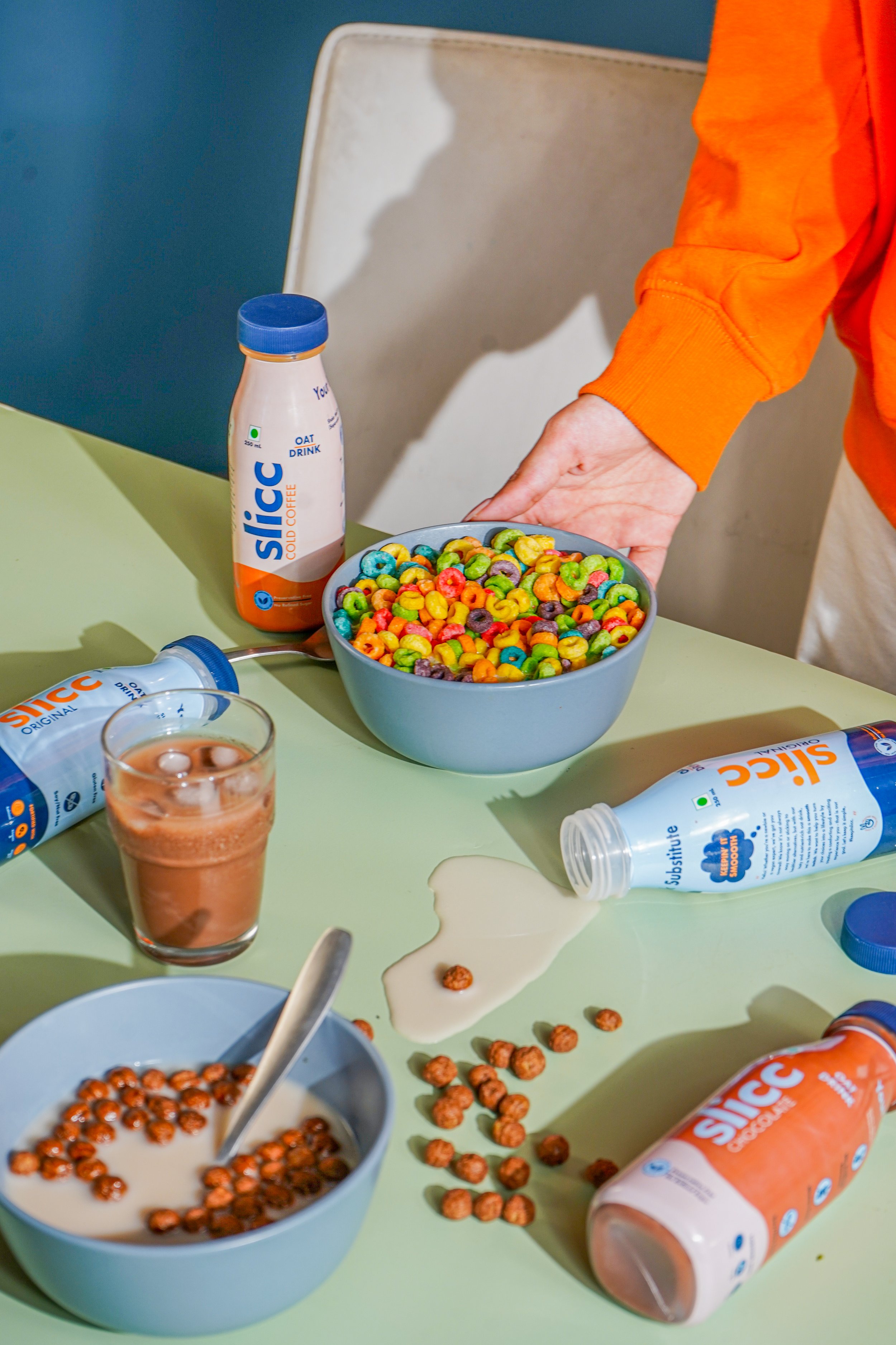
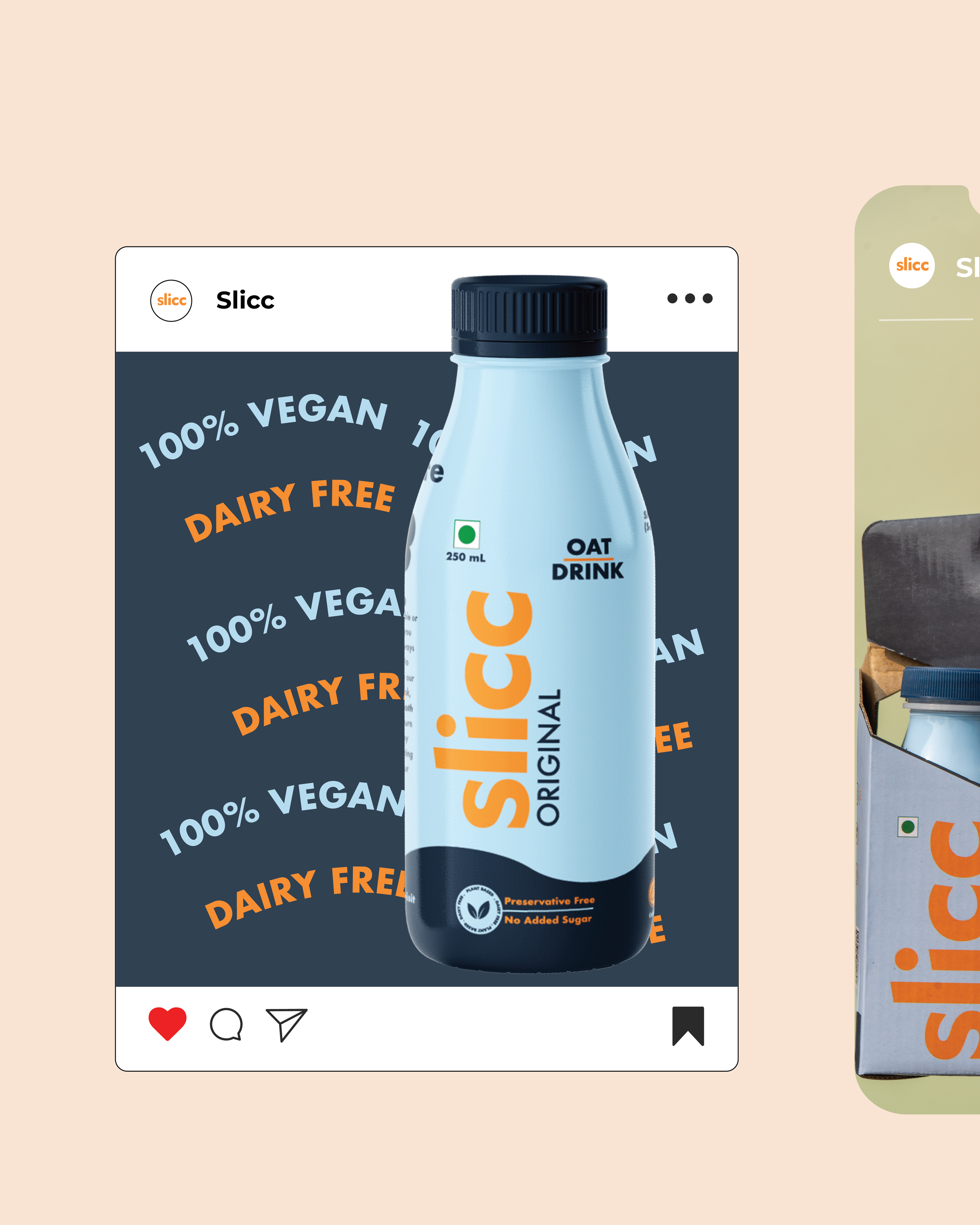
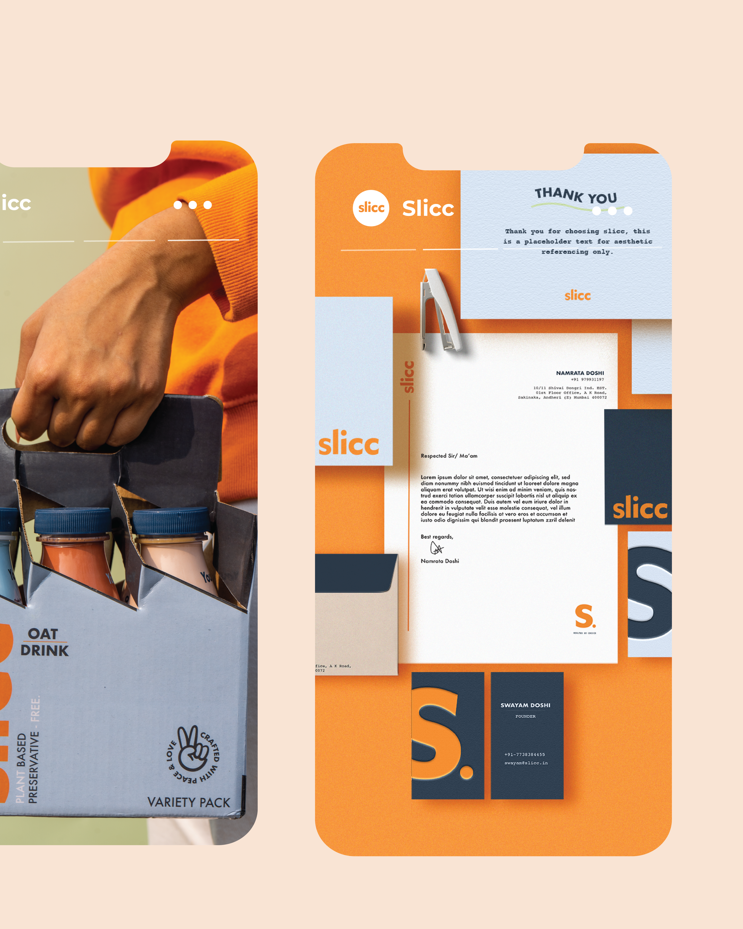
We were ready to execute post-research and strategy, creating a playful yet minimalistic brand image that comes from the heart and grabs one's attention at first glance. We used a simple, clean font with popping colours to achieve this. We chose the Futura font because it was striking to the eye in conjunction with the short name Slicc. We wanted to communicate the voice and tone of the founder, and project Slicc as a simple and friendly persona that one can trust. Slicc's appeal is bold, vibrant and community-oriented, and their communication style is informative and friendly yet casual.